Our friend Miss Whisky has interviewed Peter Arkle, the very artist behind the design of our limited edition Peter Arkle releases, and here's what she found out.
You could perhaps call it a design of fate that Scottish born, New York-based illustrator Peter Arkle ended up creating the artwork for a series of anCnoc whisky packages. Fate... good timing... a bit of magic... a case of burning ears. Whichever term you use, it seems fitting.
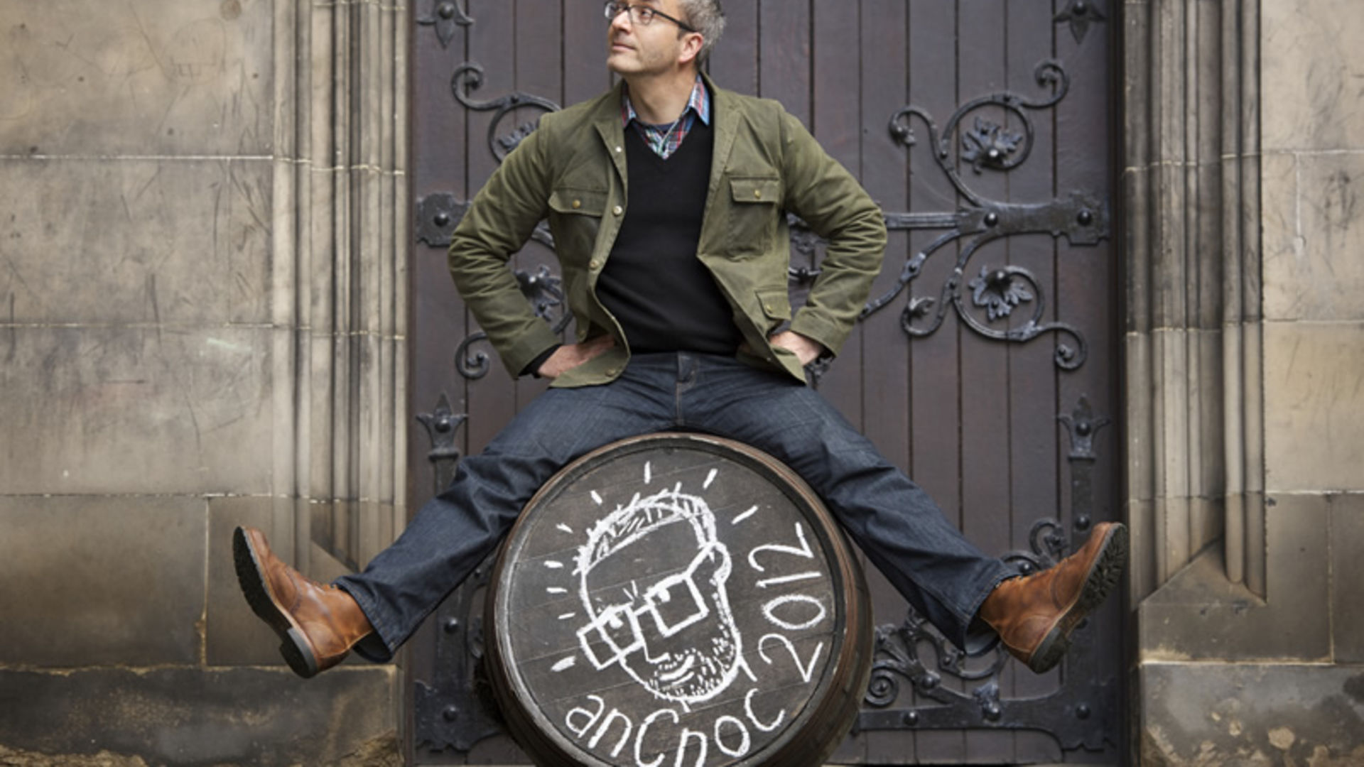
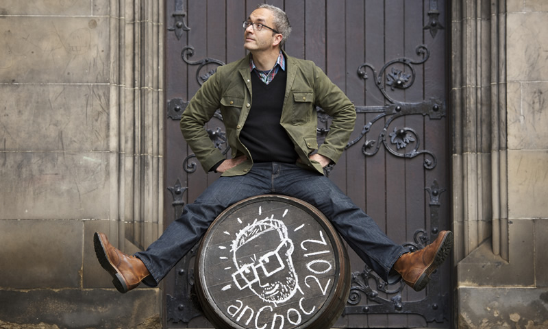 Peter Arkle at the distillery
"I'd been visiting some students at the Savannah College of Art and Design and they asked what my dream job would be. I said I'd love to do packaging for a whisky company and a few months later I got an email out of the blue from the anCnoc people and they asked me if I'd be interested," he explained in a recent phone conversation.
"I had to be all laid back saying it could be of interest," he continued, laughing. "As a freelancer, you never know what's around the corner but when it goes well and something great and interesting turns up, those are the best things in life."
Arkle has spent much of his life as an illustrator across the pond, having relocated to New York from London in 1995. His drawings have appeared in everything from The Washington Post and The Wall Street Journal, to Golf Digest and Cottage Life.
When he was asked to come on board to put together a series of illustrations it meant a trip to his homeland and a first eye-opening look into the industry that makes Scotland famous.
"They got someone who was really interested in whisky but who'd never been to a distillery before. I wasn't at all jaded about the whisky making process and I didn't have to pretend to be excited because it was all new," he said.
"Whisky is something very special and if the packaging can help people to think about that for a second, it's important."
Over five days, Arkle explored every aspect of the distillery, putting together a set of possible ideas for packaging options. This resulted in initial designs which walked the line between clean striking images and more wacky ones.
"There was a whole packaging with a rubber rat that was hanging around the distillery, up, up, up this ladder where the malt comes in and he'd have looked very good on a bottle but they went with the more simple things," he explained.
Those have so far included the first release based on the ingredients used to make whisky (malted barley, yeast and water, along with a dash of magic), a second one which captured the seemingly limitless casks in a warehouse and the latest, called Bricks, which celebrates the sturdy blocks that put together make a house for ageing spirit.
Arkle chose these as potential illustrations because he wanted something that was both graphic and that would stand out on a shelf, but also as a tribute to the whole process behind whisky making, the stories that make it unique.
"Whisky is something very special and if the packaging can help people to think about that for a second, it's important. When I'm doing drawings it's all about telling a story, whether a short one or a funny one; it's a lot like writing, it's telling a story. If you can get people interested in the story of the whisky of the bottle they're holding then that's a cool thing," he said.
Arkle continued: "Each of the designs reflects some piece of that. Even in the 'Bricks' edition you can think that, on the one hand, these are just bricks but, on the other, these are what make the warehouses that have stood there for so long, that have stood in the Scottish rain for all of that time and that are all black because the whisky has evaporated from casks and soaked into them. With the 'Ingredients' bottle that's about making people think about what whisky is made of. It may all be made from three ingredients but each has that bit of magic to make it different. I think it's great if packaging can help remind people of those little stories and be eye-catching."
That idea of making a whisky package shine amongst its competitors is something both anCnoc as a brand and these limited editions are very good at. For the latter, Arkle said he initially went to the Scotch Whisky Experience in Edinburgh to look at a collection, which features whisky bottles from across the decades.
"There are some really old bottles, and really fun ones; nowadays, they'd be seen as being a bit kitshy but some are really great," he said, adding one that stood out was a bottle featuring a large elephant which "seemed to have it for no particular reason."
The fact that his designs may make people stop and ponder in a similar way is an important aspect for him and he believes more of the whisky industry could benefit from abandoning much of the traditional tartan and calligraphy in favour of crisper imagery.
“Even if you go to Royal Mile Whiskies it's all pretty traditional packaging. There are some things that jump out (…) but on the whole there are a lot where you're just like 'really?' I don't want all whisky bottles to be graphic; I can be a sucker for those covered in ancient looking calligraphy, but I do think you can do a lot with packaging,” he said.
Doing so may help entice new customers to the whisky fold as well, he added.
“It will probably help to get a younger audience interested, although the price is important there too. But if there's something fresh-looking it might just be that thing that tips them over, especially if they're looking at two things similar in price,” he said.
Making note that whisky consumers may make choices based on outside appearance, rather than interior liquid, is also something Arkle believes the whisky industry shouldn't be afraid of exploring.
“We all get excited by new, interesting looking things and I don't think there's any harm in acknowledging that,” he concluded.
Although the stock of the Limited Edition Peter Arkle Collection has long since left our warehouses we hope anyone lucky enough to get their hands on a bottle enjoy this remarkable liquid inspired by Scottish illustrator Peter Arkle.